
The Striking window serves one purpose during ringing and another afterwards. Its content and appearance change accordingly. Also, it is only useful if at least one of the bells is being rung by a person. If the computer is simply ringing by itself, or it is being used for silent practice that is not being analysed, this window will have no useful content.
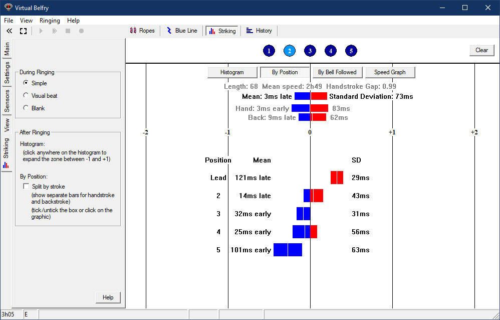
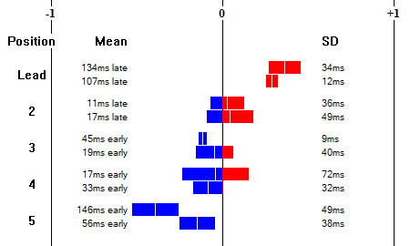
The above image shows an example of the window after ringing has finished. This particular touch was real ringing (all the numbered circles at the top are coloured, meaning that every rope was rung by a person). The method was plain hunt on five bells, with the focus here being on the 2nd bell (which has a light blue highlight to distinguish it).
Below the numbered circles are four buttons, which lead to four different graphic displays presenting different aspects of the striking (see below). Then comes a summary of the length and speed of the ringing and three coloured bars summarising the striking for this ringer (an overall summary and a handstroke/backstroke breakdown).
What the bars tell you. Each bar represents two numbers: the mean (i.e. average) placement and the "standard deviation" - a statistical measure that gives you an idea of how spread out the blows were from the overall average. Ideally, the mean should be close to zero and the standard deviation should be as small as possible (a figure in the 30s is very good ringing and in the 20s is essentially faultless). So the aim is to produce thin bars that are centrally positioned in the window. The colours show how the bar is placed relative to the central line that represents perfect striking. Blue means early, red means late.
The rest of the window depends on your choice of button from the set of four buttons at the top.
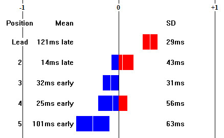
In the above example the three summary bars at the top suggest that this ringer's striking was on average quite good, but this is not the whole story. Further analysis of the By Position graphic (as shown above) reveals there is a problem: the ringer is in fact very late leading and fails to hold up enough at the back. The same graphic for the other ringers has the bars fairly accurately aligned in a column down the centre.
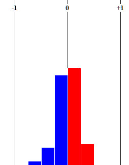
Good striking will tend to concentrate all the blows in the middle (as in the above example). In that case you can expand the central portion of the graphic to fill the screen and see a more detailed breakdown:
By ticking the "Split by Stroke" option on the control panel (or just clicking or tapping on the graphic itself), you can break this graphic down further to show separate bars for handstrokes and backstrokes in each position. Here are both options shown side by side for comparison:
| 
|
With the results split by stroke you can see that the early blows in 5th place are mostly occurring at handstroke (which, in doubles, is the second of the two blows behind, before hunting down). What is actually happening is that the ringer is dropping the handstroke in 5th place in anticipation of the need to strike the backstroke in 4th place, thereby avoiding the check on the rope that is normally needed to strike the backstroke properly. This snippet from the Blue Line window shows what this error looks like in the actual ringing:
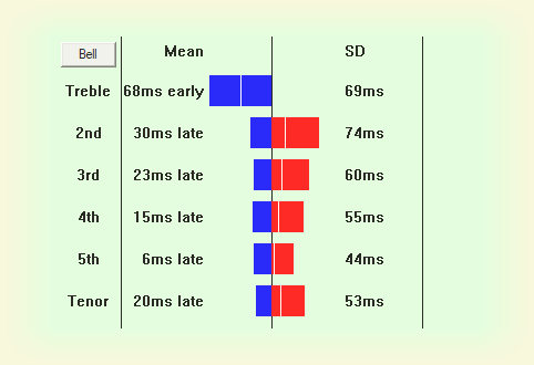
The treble is early while the rest of the band are striking quite well.
The green background is a reminder that the graphic is showing results for more than one ringer (after some real ringing, the all-of-band results and results for an individual ringer look very similar so the distinction is useful).
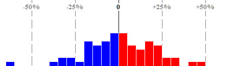
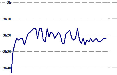
This example was from a short length of Plain Hunt Royal on a 21cwt ten. The ringing got off to a very slow start but then settled down around the 3h20m peal speed. You will notice that the line is quite jagged. This is the consequence of a trade-off in the analysis algorithm. Aiming for very gradual changes of speed in the underlying rhythm produced a smoother speed graph, but resulted in somewhat worse striking scores for each ringer, making trends in striking harder to see. Making the speed of the underlying rhythm match the actual ringing more closely tightens up all the individual scores, making it much easier to see any consistent striking faults, but at the cost of a more "noisy" speed graph. Despite this, it is still easy to see the overall variation in speed from start to finish. It is also true to say that the flatter the line the steadier the rhythm, so it is another measure of the general quality of the ringing (which in this case was rather poor).
Blank speaks for itself. Turning the screen blank during a teaching session can sometimes be useful if the student is focusing too much on the screen and neglecting to listen.
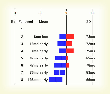
By Bell Followed
This option shows a breakdown not by position, but by the bell that was followed. Here is an example showing a ringer who is ringing the treble to major quite well (evident by the short bars), but is relying too much on ropesight and is striking too close to the bigger bells as a consequence:
Speed Graph
This option shows a graph of the way the speed of the ringing varies through the touch. For obvious reasons it is an all-of-band result and does not vary according to choice of focus bell. It is available for simulator ringing as well as real ringing, but is probably only useful for real ringing (simulator ringing tends to be a fixed speed, so the graph is a flat line).
Multiple User Bells
If there were two or more user bells participating in a touch (or every ringer in the case of real ringing), individual statistics for each ringer can be shown and it is also possible to see aggregate figures for all the ringers who took part.
During Ringing
During ringing there are three options (see the control panel):
Both the Simple and Visual Beat options are animated graphics that show the extent to which the ringer is early or late.